2021–2023 / Design lead
Play the games you want, with the people you want, anywhere you want.
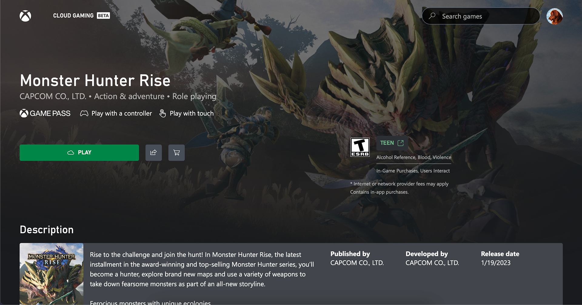
I led the launch of xbox.com/play, a website enabling players to seamlessly stream games from the cloud to their existing devices.
KEY RESPONSIBILITIES
Led design from brainstorm sessions, wireframes, prototypes, to final redlines. Met with developers for daily scrums to squash bugs and close gaps in design. Collaborated closely with UR to perform user studies on prototypes and respond to in product feedback. Shared out design decisions with key stakeholders and development team.
define
Our mission was to bring the fun of Xbox to millions of new players, particularly in markets where owning an Xbox console is difficult. Simultaneously, we aimed to deliver a familiar gaming experience that resonated with our existing Xbox players.
Considerations
Meeting the players where they are
Be responsive to any device a player has access to, from low cost phones to smart TVs. In certain markets, players are unable to or don’t want to own an Xbox console. For example, in Brazil the tariffs placed on electronic goods puts an Xbox console out of reach for many.
Frictionless play
Provide the quickest and easiest way to play in the Xbox ecosystem. Reduce time to play by eliminating unnecessary steps and lowering the cognitive load across the end-to-end experience.
Inclusivity and accessibility
Make the website feel natural and accessible whether you were using any controller, mouse, touch or other necessary input device.
There were three particular players we were focused on (from left to right):
DoctorHoot
They’ve always considered themselves a casual gamer, never serious enough to own a console. However, recently they’ve met some new friends that play Forza together once a week. How do we simplify the onboarding process and provide easy access to game with friends?
AngryDonut
They’re fully committed to the Playstation platform. Xbox.com/play could be their opportunity to play some of the Xbox exclusives they’ve missed over the years. How do we lower the barrier of entry for them into the Xbox ecosystem?
NewSasquatch
They’ve been a part of the Xbox ecosystem for many years and all of their gaming buddies are on Xbox. How do we give our existing players a fresh but familiar experience with additional features that are expected for a website?
design process
Recognizing the need for product coherence across multiple apps and organizations, we embarked to consolidate the best elements from each experience into a unified whole. Our strategy involved integrating key features, including displaying most recently used titles from the Xbox console and the browsing experience from the Game Pass App. As we progressed from beta to full release, we further enriched the offering by introducing features like party chat and messaging.
While prioritizing controller input, we remained committed to providing players with the flexibility to navigate the site and play games using any input modality, including Playstation controllers and touch controls. This required meticulous attention to detail, from designing intuitive representations of game input capabilities to refining text block selection behavior based on the chosen input method.
In order to address the issue of user churn resulting from a lack of perceived value, we made the decision to defer the sign-in process until users discovered a game that caught their interest.
Furthermore, we had a legal obligation to ensure that players encountered the ESRB rating before playing any game. As a result, the focus was to always guide the player towards the game details page across all scenarios.
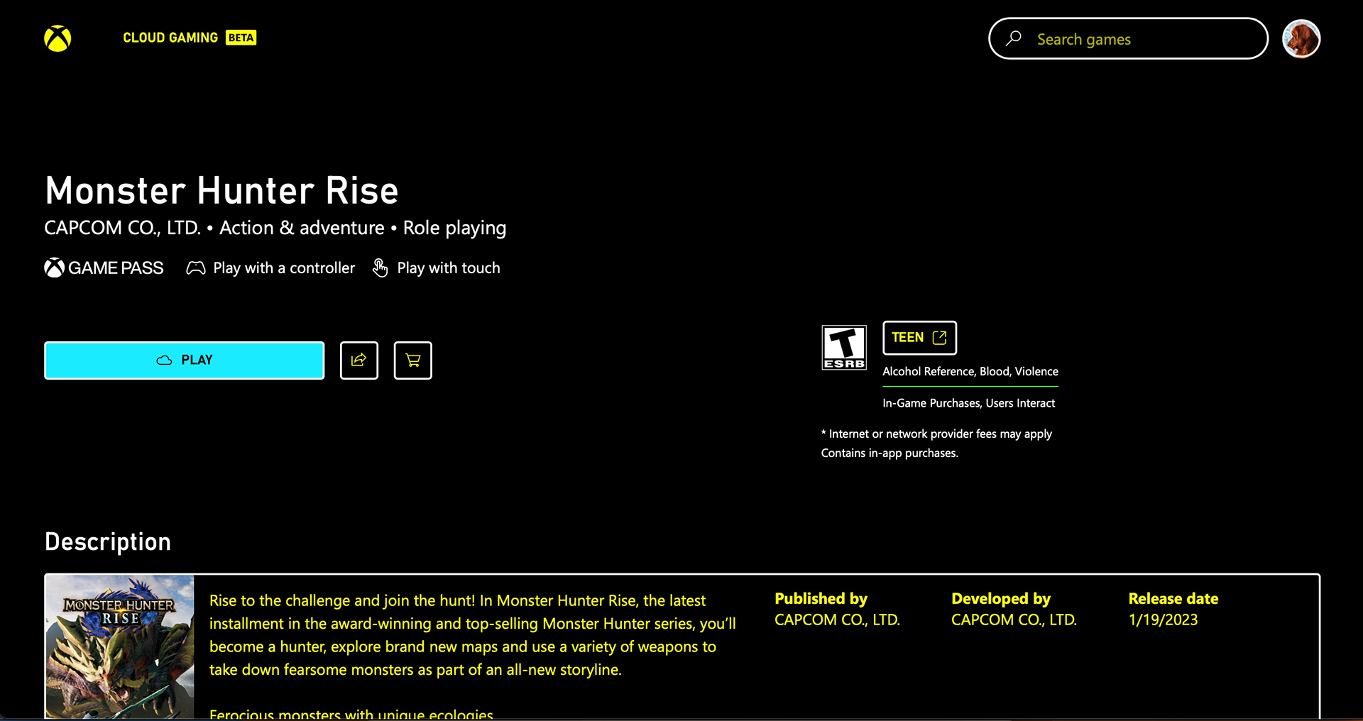
With inclusivity and accessibility as a focus, it was essential to consider all the ways we could improve xbox.com/play for everyone. This ranged from having a high contrast mode, to thinking through tab order for screen readers.


testing
Listening to customers was one of the core priorities as we shipped xbox.com/play. We did qualitative research in the lab with customers, from prototypes on different models of the website to more focused efforts like adding a particular set of features to the site, like social.
During the beta, we gathered player feedback at the end of each play session to quickly get a gauge of how the experience went. We called it ‘simple feedback’ and was a quick way for the player to let us know if the experience was good or bad and to let us know specific things they liked or may have had a problem with. We used this method of feedback as one of our OKRs, always aiming for an 85% good rating or better.
RESULT
The success of the website is proven by over 20 million people streaming a game on the website. Additionally, xbox.com/play is the hIghest rated website for Microsoft in terms of accessibility and inclusivity, based on internal standards of accessibility.
